
Everything you need to
understand and use CryptoXcope Datasets
Explore the dataset structure, analytical fields, validated insights, AI prompts and usage workflows designed to help you turn historical crypto data into meaningful research.
Dataset Documentation
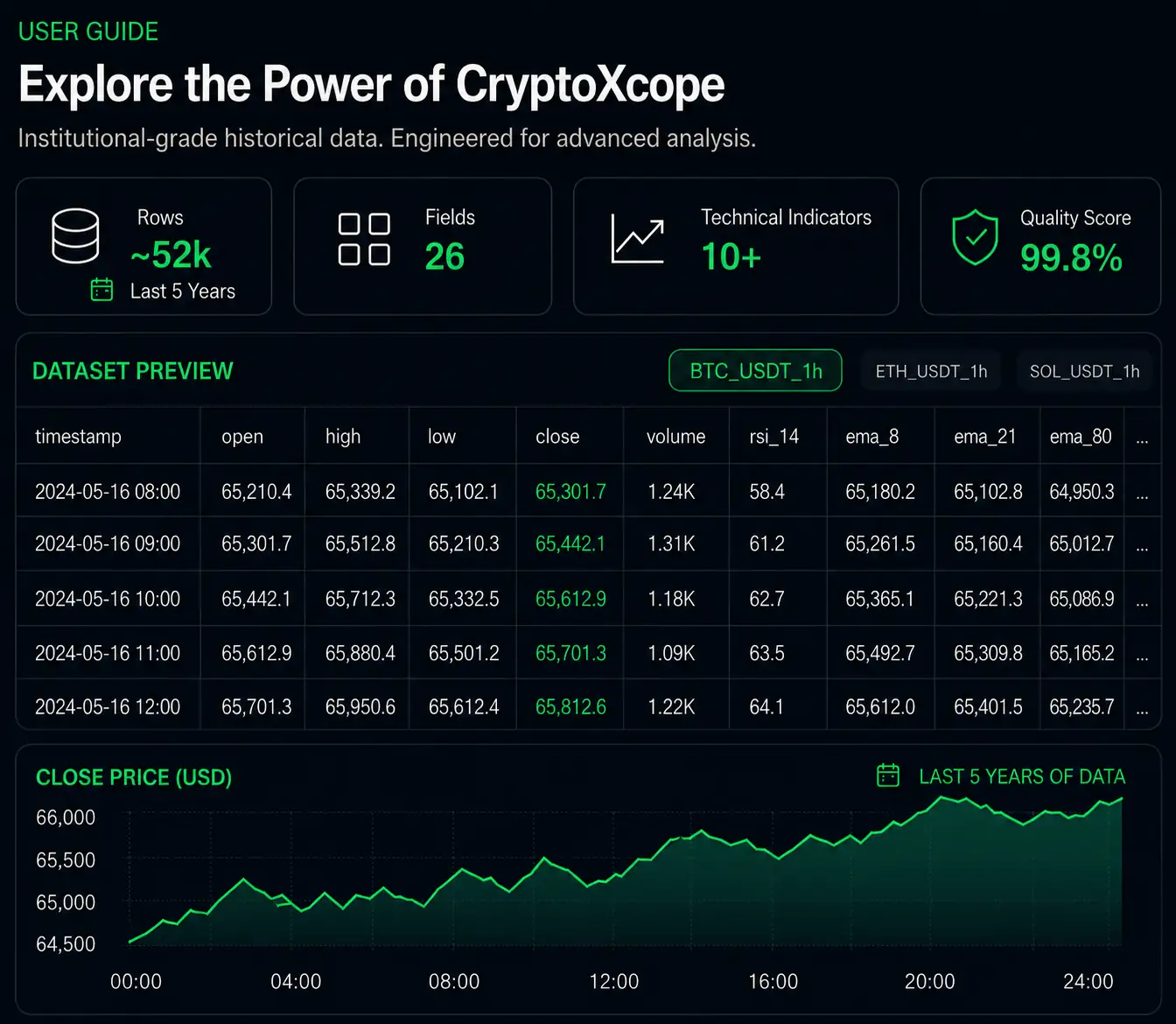
See how the datasets are structured, what each field means, and how to use them for research, backtesting and AI-assisted market analysis.
Six tools to move from question to insight
Explore validated findings, AI prompts, research workflows and dataset documentation in one place.
Real Data Insights
Explore statistical findings grounded in real CryptoXcope datasets.
AI Prompt Library
Use ready-to-test prompts with ChatGPT, Claude, Gemini or your AI assistant.
Research Ideas
Turn natural market questions into structured investigations.
User Guide
Understand every field, formula and analytical feature included in the datasets.
Dataset Structure
See how each file is organized across assets, timeframes and engineered columns.
Research Workflow
Move from question to evidence using structured data and AI-assisted analysis.
What the data actually revealed
These examples are based on real CryptoXcope dataset analysis. They show the kind of evidence users can uncover with structured market data.
How often does Bitcoin fall into extreme fear — and what usually happens next?
In over 1,850 daily candles of Bitcoin history, RSI dropped below 25 on only 30 occasions — just 1.6% of all trading days. Those rare moments, dismissed by most as danger, told a different story in the data.
The data doesn't tell you what to do. But it does tell you what happened — every single time.
Bitcoin spent only 36% of its history in a confirmed uptrend. What did the other 64% look like?
Using EMA alignment as a trend filter (EMA8 > EMA21 > EMA80), Bitcoin was in full bull alignment for just 36% of all trading days in the dataset. The numbers that follow are not a forecast. They are history.
The market doesn't move in a straight line. But trend regimes have historically been far from random.
BTC and SOL spent almost the same time in bull alignment. Why did SOL return 10x more during those periods?
Apply the exact same EMA alignment methodology to two different assets — same formula, same dataset structure, same timeframe. SOL spent less time in alignment, but generated more return.
The same question, applied to different assets, produces radically different answers. This is what cross-asset research with consistent methodology reveals.
Periods of lowest volatility in Bitcoin historically preceded stronger returns than periods of high volatility. Is calm actually a signal?
ATR measures daily price movement. When ATR fell into the bottom 20% of its historical range — the quietest, most boring market conditions — what came next?
The loudest, most volatile periods produced the weakest average forward returns. The quiet periods produced the strongest. This is counterintuitive. That's exactly why it's worth investigating.
After extreme volume spikes in XRP, bearish-looking candles produced better forward returns than bullish ones. How do you explain that?
When XRP experienced volume spikes above 3x average, the conventional assumption was simple: bullish spikes should lead to stronger follow-through. The data disagreed.
Bearish volume spikes — panic, capitulation, forced selling — were followed by stronger recoveries than bullish ones. The narrative said 'sell.' The data said something else.
When Ethereum falls more than 20% below its long-term moving average, does it mean more pain ahead — or is it historically closest to recovery?
Using distance_ema_80 to measure how far ETH has stretched from its long-term anchor, two opposite extremes emerge. ETH was more than 20% below EMA80 on 10.8% of trading days, and more than 20% above EMA80 on 10.1% of trading days. Same distance. Opposite direction. Completely different outcomes.
When ETH looked most broken, the data said recovery was closest. When it looked most unstoppable, the next 60 days returned essentially nothing. The crowd read the trend correctly. The timing was another story.
Start conversations with your data
Upload a CryptoXcope dataset and explore market history using natural language.
Test a Buying-the-Dip Hypothesis
“Analyze the uploaded dataset and find every period where price declined while the broader trend remained positive. Translate this into objective filters using the available columns, then check what happened over the following candles. Summarize recovery rate, failure rate and the conditions that separated successful recoveries from deeper corrections.”
Study Trend Quality
“Find periods where the faster market trend was above the slower long-term trend. Then evaluate whether price actually continued rising afterwards. Compare cases where the trend continued with cases where it failed, using momentum, volatility and trading activity as supporting evidence.”
Understand High-Volume Moves
“Identify moments where trading activity was unusually high compared with normal activity. Analyze whether those periods were followed by larger price movements, and whether those moves were more often upward or downward. Explain why high activity does not always mean bullish continuation.”
Research Quiet Markets
“Find periods where the market traded quietly with unusually small price ranges for several candles. Analyze what happened afterwards. Did quiet markets usually lead to large moves, or did they often remain quiet? Support the answer with evidence from the dataset.”
Compare BTC, ETH and XRP Behavior
“Compare the uploaded Bitcoin, Ethereum and XRP datasets. Focus on how each asset behaved after strong trend conditions, sharp pullbacks and unusually high trading activity. Identify which behaviors were shared across assets and which appeared asset-specific.”
Find Historical Market Twins
“Using the latest rows of the dataset as the current market condition, search the historical data for similar periods based on trend, momentum, volatility and trading activity. Rank the most similar cases and summarize what happened afterwards. Do not use external data.”
This is what a real investigation looks like.
We uploaded BTC_USDT_1D to an AI assistant and asked a single question in plain English. No code. No formulas. Here's what came back.
How often does Bitcoin fall into extreme fear — and what usually happens next?
Instead of reacting to price drops, we asked an AI to find every historical moment where Bitcoin's momentum reached extreme low levels — and measure what actually followed.
RSI dropped below 25 on only 30 occasions across 1,850+ daily candles — just 1.6% of all trading days. Those rare moments, widely treated as danger signals, told a different story in the data.
From question to insight
CryptoXcope helps you move from curiosity to structured research, then from evidence to better decisions.
Download Sample
Start with the free sample package.
See What's Ready
Review prices, indicators and engineered features.
Ask Your Question
Describe what you want to investigate.
Ask AI
Use prompts to investigate market behavior.
Generate Insights
Validate ideas with historical evidence.
Structured data built for research, not just storage.
Each CryptoXcope dataset combines raw OHLCV market data with engineered analytical fields designed to make research easier. Instead of starting from empty price candles, users receive ready-to-analyze columns for trend behavior, momentum, volatility, trading activity, candle structure and distance from key moving averages.
A question like “when is ETH furthest from its long-term anchor?” maps directly to distance_ema_80 — a field that does not exist in standard OHLCV data.
You've seen what
the data revealed.
Now run your own analysis with pre-engineered crypto datasets — ready to investigate from the first row.
No coding required · Works with Excel, ChatGPT, Claude or Gemini · CSV ready-to-use